

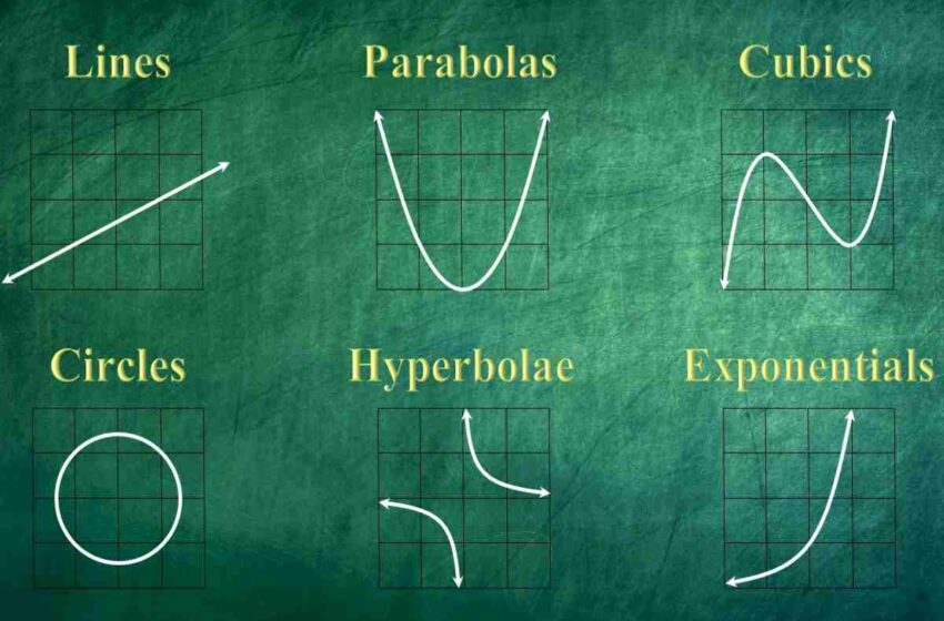
Different Types of Line Graphs
There are many types of line graphs, each with its purpose. Line graphs are essential because they can show different aspects of data and how it has changed over time. Keep reading to learn about the types of line graphs and when to use them.
Table of Contents
What are Line Graphs?
A line graph is a way of visually representing data. It shows how one or more variables change over time by plotting points on a coordinate plane. The x-axis represents the period of time, while the y-axis represents the variable being measured. A line will connect all of the points, and the slope of the line can be used to determine how quickly or slowly the variable is changing. Many different types of data can be plotted on a line graph. There are also many different types of line graphs that can be used to visualize data.
Some examples of data that can be plotted on a line graph include temperature, precipitation, and population size. Let’s take a look at how population size can be plotted. If you wanted to track the population size of a city over the course of a year, you would need to take measurements at different points in time. Then, you would plot those points on a graph, with the time on the x-axis and the population size on the y-axis. The slope of the line would give you an idea of how the population size changed.
What are the Types of Line Graphs?
Some of the most common line graphs include:
- Linear graph. This is the most basic type of line graph, and it’s used to track changes in a single variable over time. The linear graph is good for showing how a trend changes over time, but it can’t show fluctuations in data or relationships between two variables.
- A scatterplot is used to track relationships between two variables. It plots points on a coordinate plane, with each point representing a pair of values for both variables. The closer the two points are, the stronger the relationship between those two variables is supposed to be. Scatterplots are good for showing patterns in data, but they can’t show trends over time as linear graphs can.
- Bubble chart. A bubble chart is similar to a scatterplot, but it uses bubbles instead of points to represent big data values. The size of each bubble corresponds to one of the data values, while the color of each bubble corresponds to another variable. Bubble charts are good for visualizing complex relationships between multiple variables at once.
- Line chart. A line chart is similar to a linear graph, but it’s used when you have more than one series of data that you want to track over time. This type of graph allows you to compare trends among different datasets simultaneously.
- Time-series. This line graph is used to track data over a period of time. The x-axis typically represents time, while the y-axis represents other variables, such as population size or average temperature. Time-series line graphs are most commonly used to visualize trends over time.
How can you Interpret a Line Graph?
To interpret a line graph, you need to look at the lines and the data points they connect. The lines in a line graph show how the data points are related. The lines can be straight or curved, and they can go up, down, or stay the same. The data points are the points on the graph where the lines intersect. The data in a line graph can answer questions about how the data changes over time. For example, you can use a line graph to answer the question, “What is the average temperature over the past year?” You can also use a line graph to answer questions about how different data points compare. For example, you can use a line graph to answer the question, “What is the difference in temperature between January and July?”
Conclusion
Overall, line graphs are essential because they allow you to track changes over time. This can be helpful for various purposes, from understanding how your business is doing to monitoring your progress.